Investments.com
Overview
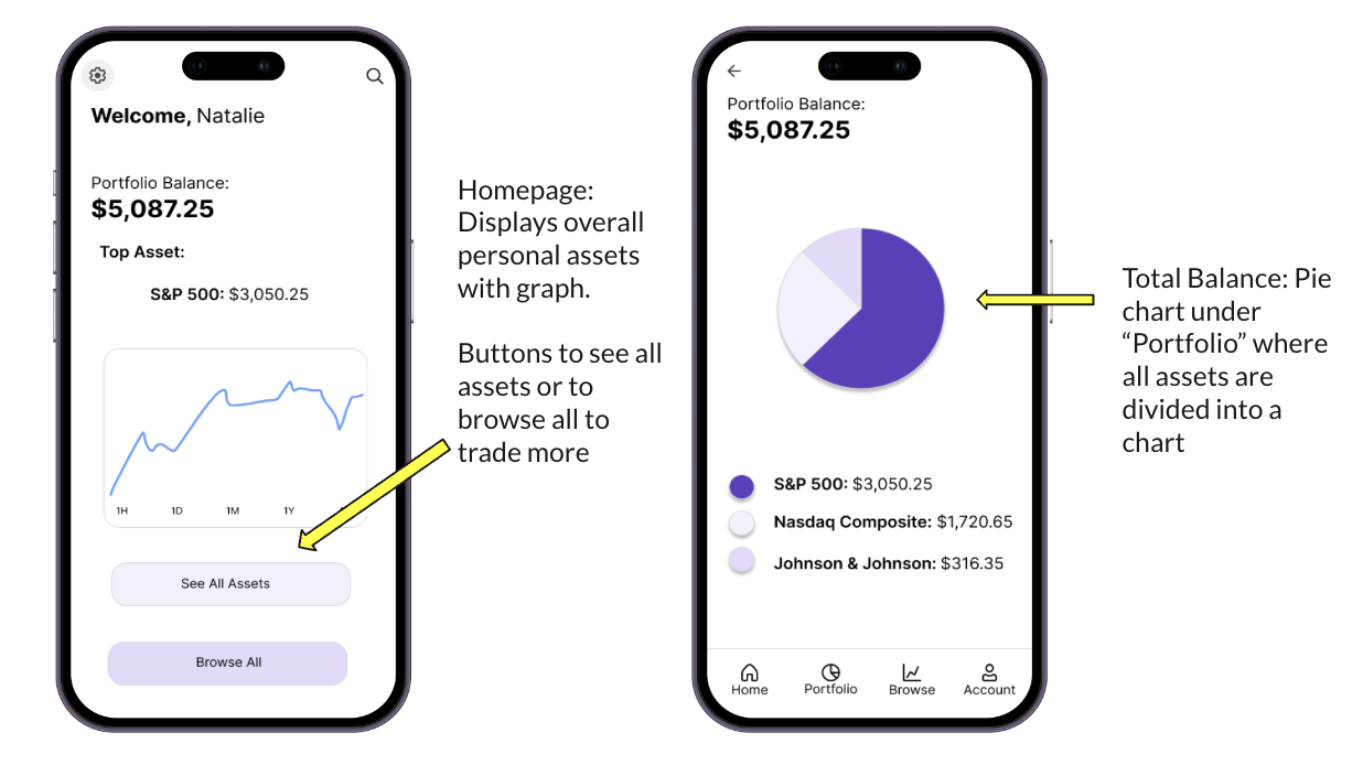
I created the Investments.com app where average customers can buy and manage their stocks. The goal of this app is to help users navigate the buying and selling stock trade process easily and streamline the online investing process. The specific area I designed was the home screen so users can check on their portfolio balance and see what is happening in the market with their stocks. Having an easy to read and visually appealing interface is crucial for users, especially when dealing with large numbers as it can easily be overwhelming.
My Role: UX Designer and UX Researcher
Competitor Analysis
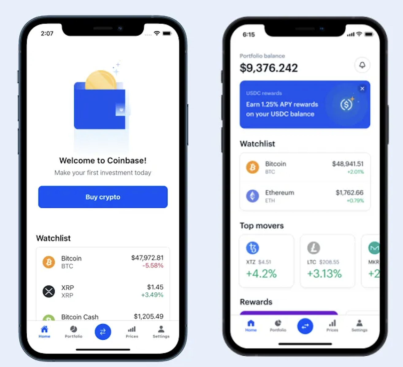
Coinbase: Coinbase is an app that allows users to manage their cryptocurrency portfolio from their computer or phone. This app has a really simple yet elegant user interface and has an entry-level “vibe” that is very approachable to new investors. The downside to Coinbase is it only applies to crypto and users cannot link their other portfolios with it. It also only features currencies that the app partners with, so users may not get the full spectrum of other cryptocurrencies.
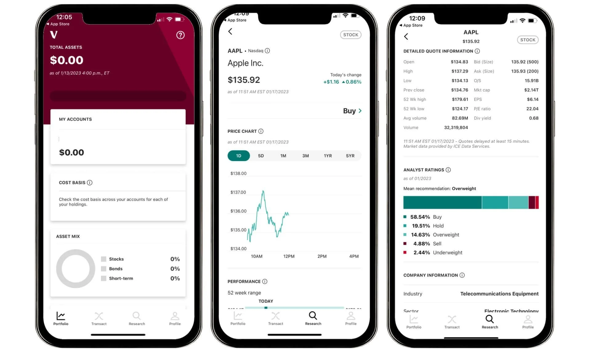
Vanguard: Vanguard is an investment company with their own website and app. Content wise, they are very thorough and allow lots of investment options. However, it lacks the strong design and minimalist interface of Coinbase. This app is good for more experienced investors but may look a little intimidating to newbies.
Takeaways
Coinbase is easy to navigate and has a simple interface with contemporary design style. It lacks more in depth trading information and graphics. Vanguard has a bit clunkier design with smaller and hard to read text that is all jammed together. However, it has everything you could ever need in regards to information about your investments.
Solutions
The design of Investments.com will be easy to read and use a minimalist interface like Coinbase that is less intimidating for a user who may be new to investing. Investments.com also has multiple options to view portfolio balances and market trends, so that users have more visual representations of their investments in the way that Vanguard has, but without all the clutter and tiny fonts.
Information Architecture Map
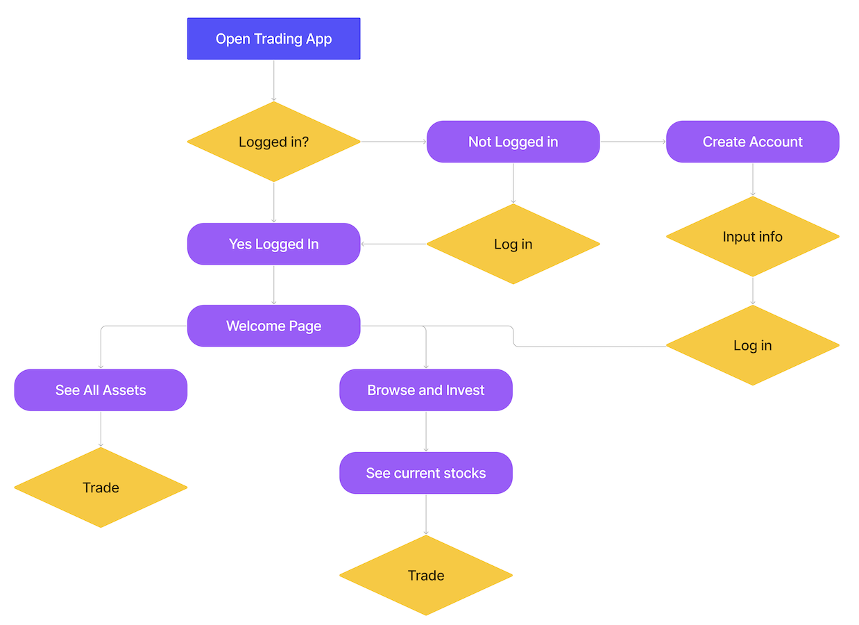
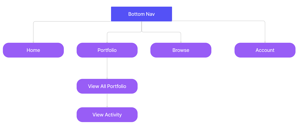
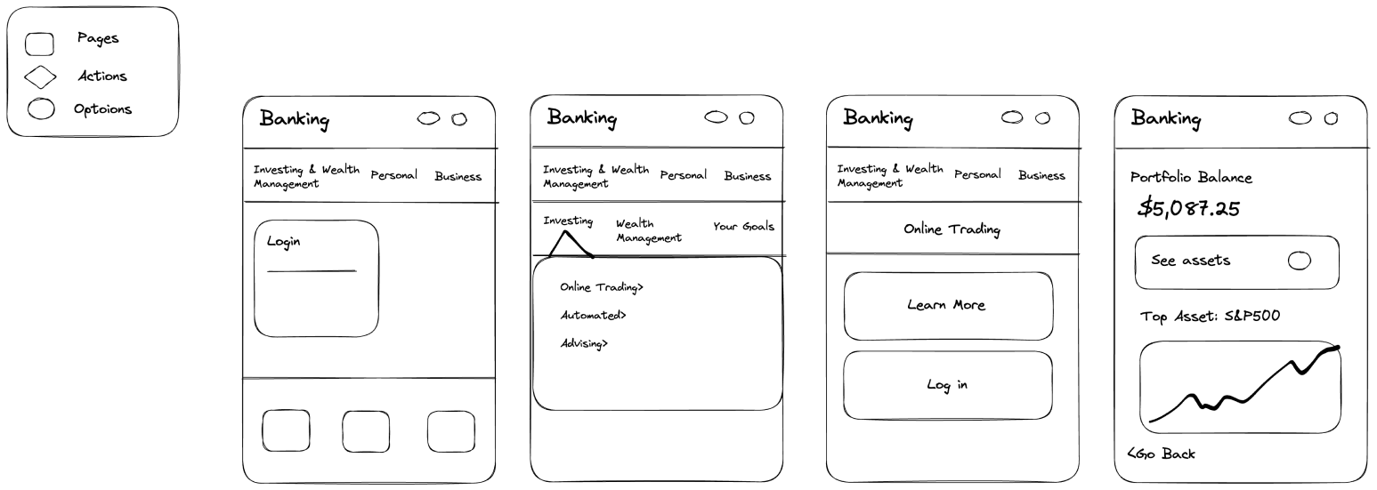
This map represents several different flows for this app. These flows include a login page, a portfolio page, and a bottom navigation. For the final design, I focused my flow for the home page into a graph screen.
Wireframe Sketches
Final Wireframes


Vision Statement