GRUBHUB
Overview
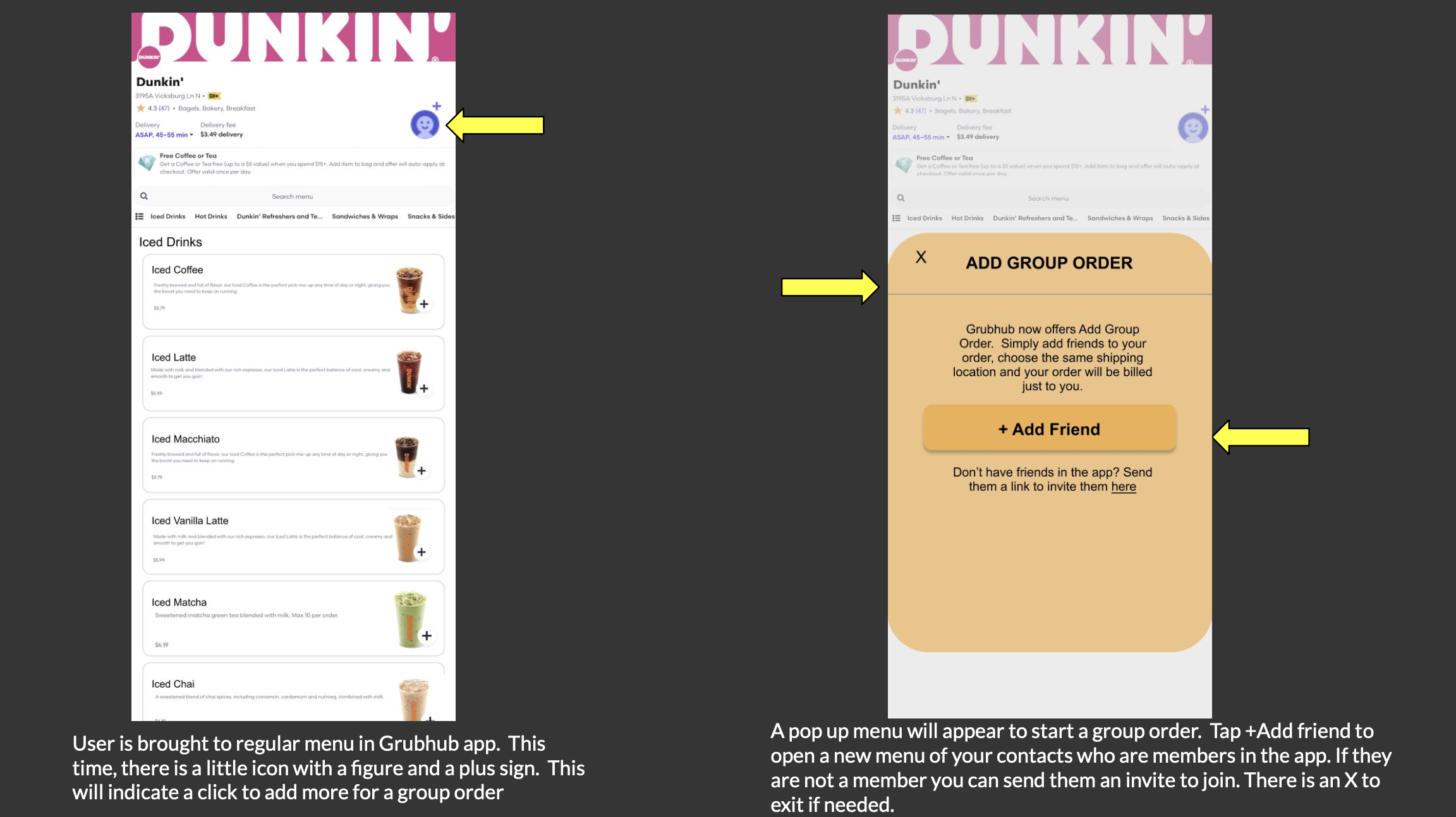
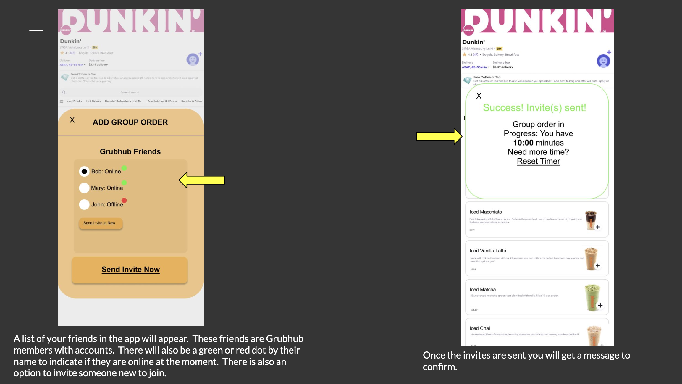
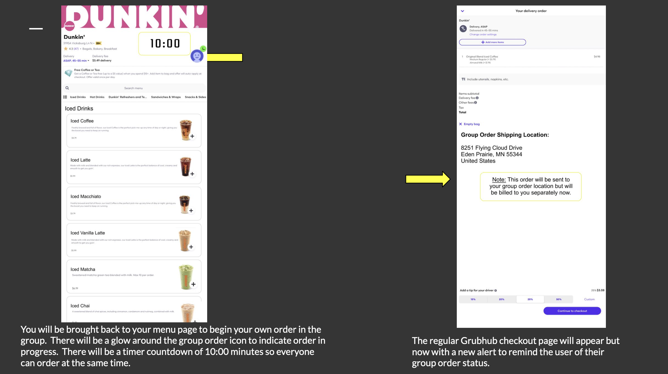
To optimize Grubhub’s shopping experience for users, I redesigned the group order feature with a personal goal to practice the research phase of UX design. Currently, Grubhub only offers group ordering options for those who pay a premium and qualify for corporate accounts. My redesign features a new section where members can select items that are added to a group cart, but their bill is sent separate.
My Role: UX Designer and UX Researcher
User Interviews
I interviewed 2 subjects about their experience using a food order service. Interviews included questions like “Do you prefer to eat in a restaurant or to have dinner at home?” and “When using a delivery service do you mostly order for yourself or for a bigger party or group?”.
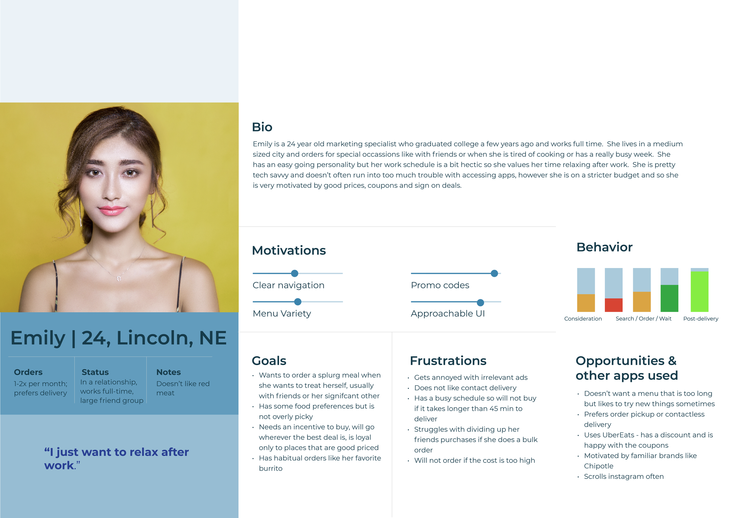
Users placed high priority on: price point, having a time threshold for order arrival (if it was over 45 minutes they would often cancel), student or other discounts, and more menu item variety. Based on my interview results, I created the user persona Emily, who reflected the median data for the the type of client I was designing for.
User Persona
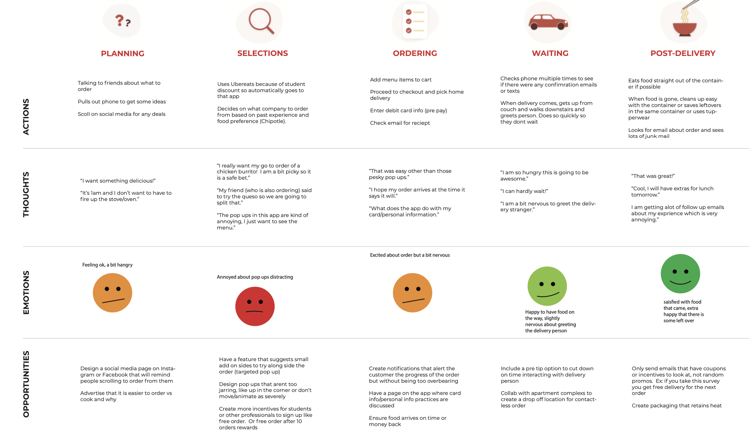
User Journey Map Main takeaways:
50% of users had difficulty with orders arriving to the correct house.
75% of users order with a friend.
50% of reviewers felt overwhelmed with food options and had trouble finding what they were looking for.
Solutions
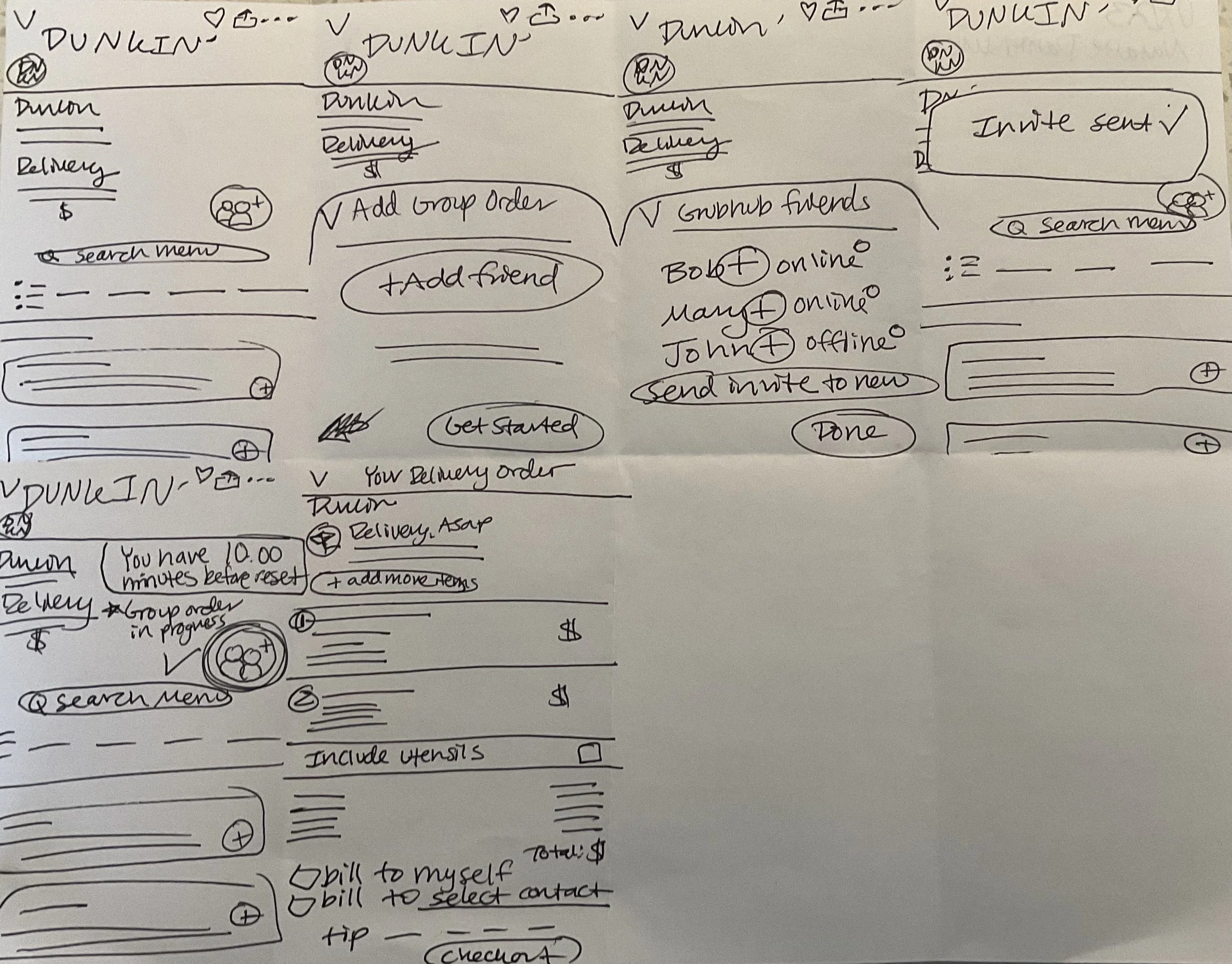
My redesign will have a brand new feature added to the order menu page. There will be a “add group” button. This button will then pull up a drop down menu for people to add their friends who are members to their order. If you have ever played Pokemon go and done a raid with friends, it is a similar concept. Orders will the be filled out and the bills will be split privately to you but it will all go to the same location in the group.
This will help users who find it to be a struggle coordinating large orders with a big group of friends. For example, my persona I created, Emily, is a young adult who often orders with her significant other or friends. She doesn’t order frequently, but when she does it is a treat and they usually do a big order. Letting Emily be able to separate her bill through the app will give her overall more control in the app and enjoyment.
Competitor Analysis
In my competitor analysis I compared GrubHub to Uber Eats, Doordash and Caviar. Overall, GrubHub received the best rating in comparison to the other apps however there were a few interesting takeaways to note. One was that GrubHub was significantly less expensive than the other options, including Uber Eats which is a very common app our interviewees used in our surveys. Promoting the best deals for GrubHub could be a good way for it to stand out over the others. Another area to note is the easy navigation. GrubHub received a high rating because it was minimal and was not overwhelming. However, there may not be enough options for some people so this could be an area to focus on partnering with more food companies for more options.

Heuristic Evaluation
We had 8 reviewers. Heuristics used included User Control and Freedom, Aesthetic and Minimalist Design and Consistency and Standards. Tasks performed included performing mock shopping experiences with these scenarios in mind: moving to an area you are unfamiliar with, shopping with food restrictions, running through the delivery process when living in a hard to find area, are in a hurry and need something cheap and quick and someone with a disability who has trouble viewing the app. Data was collected on these themes: overall navigation, color pallet and design, checkout page and costs.
Positive Points:
Primary goal and purpose is clear
Aesthetic color pallet and appropriate use of white space
Variety of food options
Pain Points:
Organization of information, especially menu items
Overwhelm
Cost and lack of deals
Troubleshooting Ordering: Especially for groups and suburban locations

Wireframe Sketches
Final Wireframes
