Delta Gamma Foundation Website
Overview
Currently, I am tasked with an ongoing redesign project for the Delta Gamma Sorority Foundation website. The goal of this project is to redesign the Foundation tab of the website so that it is easier to navigate for donors and members. This page serves as an important educational resource about the philanthropy so it is important for visitors to be able to use the tabs properly.
My Role: UX Designer and UX Researcher
Questionnaire
To get a better understanding of how users were responding to the website in its original state, I conducted a user survey for users to describe why or why not they use the website service. From these results, our team concluded that the biggest issues our website tab was it took users longer than expected to access information, and for a visually impaired user it took over 20 minutes to navigate our page via page reader.
Based on these findings we came up with the following ideas:
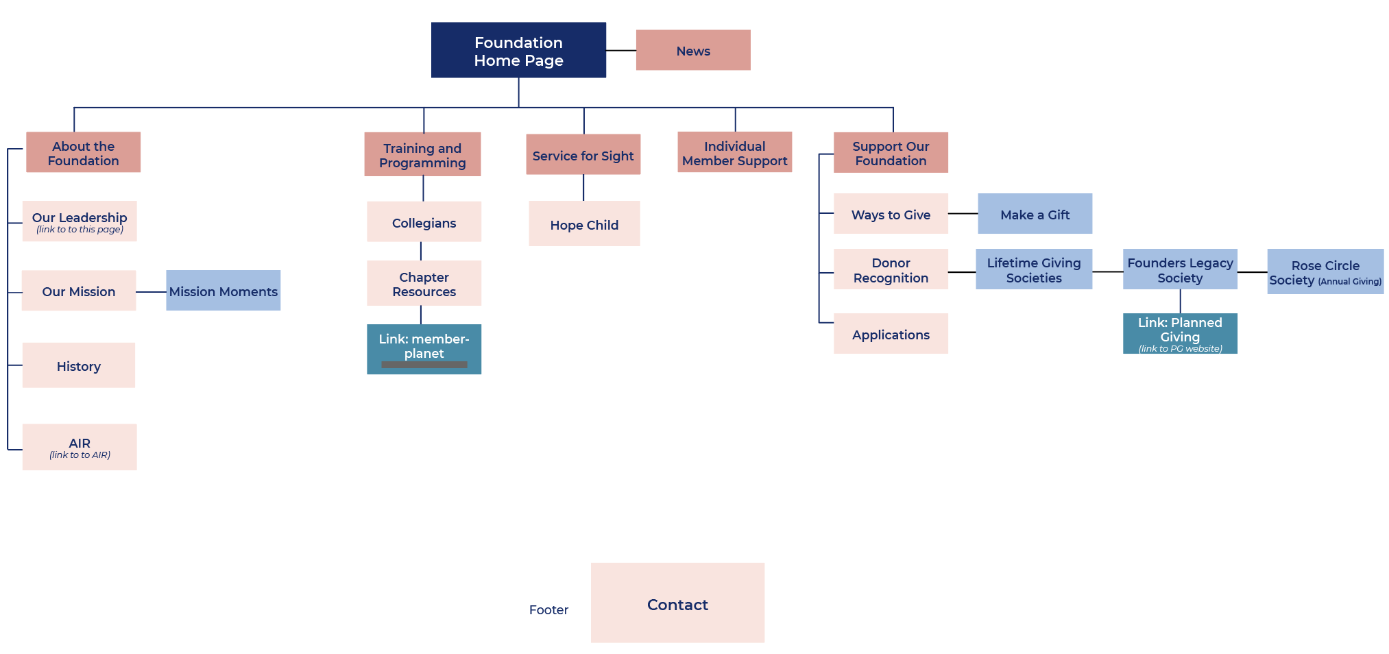
Remove the third option menu (shown below in Figure 1). This will relieve the page from text heaviness and direct users to only use the drop down menu.
Condense and rename existing tabs. This will streamline navigation and allow members to click right into the resource they are looking for. Tabs with unique names like “Our Foundation” are not organized the same way for a page reader alphabetically and can jump around and confuse those using one.
Phase 1: Redesign Old Webpage Menu Navigation

Figure 2
The old version of the website currently contains 3 option menus, 1 of which is a full drop down for all sections (figure 1). Figure 2 shows the old version’s 10 drop down options.


Figure 1